Market Update – Bitcoin Trying to Turn Around
Bitcoin has kept the market on its toes as it continues to range between weekly support at $32,000 and near term resistance of the 200DMA currently at $42,000.
Uncertainty after the recent crash and fears around President Biden’s announcement at the G7 Summit this coming weekend around how the US will tackle cryptocurrency in relation to recent ransomware attacks, are holding price down for now.
The fact that price has now spent several weeks below the 200DMA is not a bullish sign. A weekly close below $32,000 would further dampen hopes of a quick bounce back into a bull market.
However, closes above the 200DMA and 128DMA would bring a lot of confidence back into the market.
At Decentrader we will continue to monitor the Weekly Predator indicator shown on the chart below, which caught the recent market top. A green weekly candle on Predator should indicate that $BTC is once again ready to start trending to the upside.
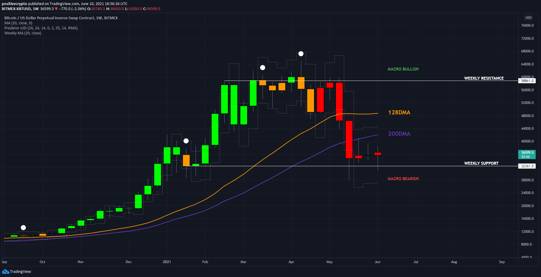
Figure 1: $BTC weekly chart using Predator Indicator.
You can access the Predator Indicator HERE.
Bitcoin 4hr
After the recent crash, $BTC price action has been confined to a range. During the past couple of weeks, funding grew increasingly negative as concern grew over $32,000 support being lost. For now, that appears to have been a fakeout on the 8th of June, with price since reclaiming the POC (point of control) and mid-range support at $36,000, as well as reclaiming the 128MA.
Should Bitcoin continue to climb up, the next clear target is the 200MA as it makes its way towards the round number of $40,000.
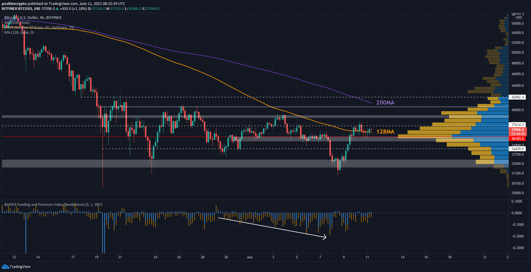
Figure 2: $BTC 4hr reclaiming the POC and the 128MA today.
On-chain: Active Addresses Sentiment Indicator
An on-chain indicator yesterday triggered an ‘oversold’ signal, suggesting that $BTC may soon be ready to turn around and move to the upside. It is the Active Address Sentiment Indicator which can be viewed here.
The indicator compares the 28-day change in price with the 28-day change in on-chain active addresses. In doing so it is able to show whether the price is over or undervalued relative to user activity on the Bitcoin blockchain.
The change in price is shown by the orange line.
Change in active addresses is shown by the band of grey lines with green and red dotted lines on either side.
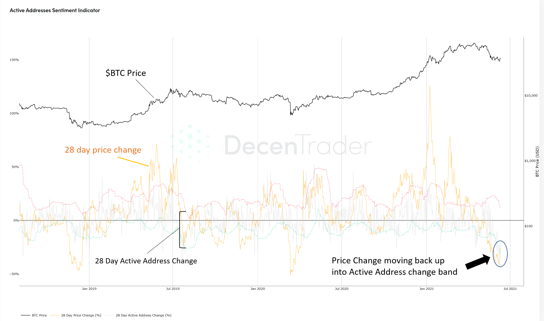
Figure 3: Active Addresses Sentiment Indicator giving a bullish signal.
When change in price (orange line) is below the active address change band lower boundary (dotted green line) and moves back up into it, we get a bullish signal.
Two notable times where this happened previously were shortly after the 2018 bear market bottom, and shortly after the March 2020 Covid crash.
We received the same signal yesterday, suggesting that $BTC price was oversold relative to active addresses on-chain and could now be ready to bounce back over the coming weeks.
SOPR – On-chain selling at losses is reducing
SOPR (Spent Output Profit Ratio) shows whether bitcoin wallets are selling at a profit or loss on any given day. When price drops rapidly in bull markets we see increased selling where wallets have to sell at a loss. This is shown by the green bars on the chart below.
After the crash, we saw sustained loss selling over the past couple of weeks, but are now starting to see some signs that SOPR is resetting, with the last couple of days showing that on average wallets were selling at a profit.
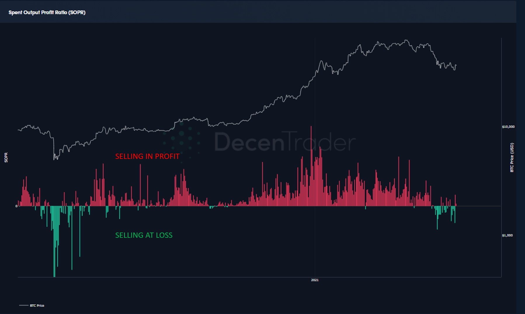 Figure 4: SOPR (Spent Output Profit Ratio).
We saw a similar situation after the Covid crash where wallets on average eventually began to sell in profit as price rebounded. We will have to monitor this along with other indicators to see if Bitcoin can do the same again this time.
Stock to Flow (S2F) Divergence – We are at the extremes
The Stock To Flow chart attempts to lay out a potential roadmap for future $BTC price based on the concept of stock-to-flow ratios. The stock is the amount of bitcoin already available in the market, the flow of bitcoin is the rate at which newly mined bitcoin is entering the market.
You can view the live chart at Decentrader here.
What is interesting about Stock to Flow right now is how far price has moved away from the Stock to Flow line. The divergence tool at the bottom of the Stock to Flow chart shows the extent to which price is moving either side of the stock to flow level.
On the chart below we see price is trending below the stock to flow line and has only ever been this far away from it four times previously in Bitcoin’s entire history.
I have highlighted these instances with orange arrows.
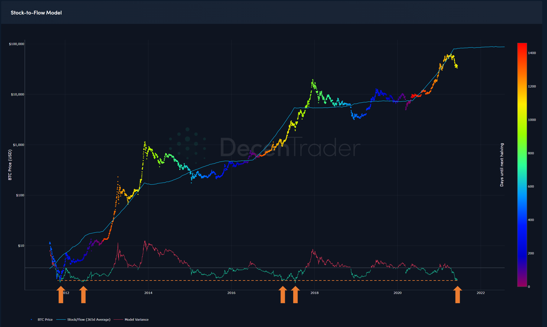
Figure 5: Price has only ever been this far below S2F line four times before in Bitcoin’s history.
After each of these times in 2012, 2013, and 2017 price rebounded hard as it tried to catch back up with the stock to flow level.
The last time was in the 2017 bull run when price was at $1,900 before rallying up to $5000 in the following 6 weeks.
While we may not rally so hard and fast this time, fundamentally nothing has changed with how Bitcoin works, nothing is broken, we are just experiencing a lot of bad media coverage after a strong rally at the start of the year.
So we may well see price make its way back up to the stock to flow line in the coming months. This would mean new all-time highs for $BTC before the end of this year, as the Stock to Flow line is currently sitting at $85,000.
Speak soon,
Philip Swift.
Want to learn more? Join our community here.
Disclaimer: Nothing within this article should be misconstrued as financial advice. The financial techniques described herein are for educational purposes only. Any financial positions you take on the market are at your own risk and own reward. If you need financial advice or further advice in general, it is recommended that you identify a relevantly qualified individual in your Jurisdiction who can advise you accordingly.


